
Intro
In high school, in the days of audio vinyl, a lot of arty kids fantasized about creating cover art for rock and roll albums.
I wasn’t one of them.
I also didn’t collect comic books. Well, maybe I read ones like Mad and Doonesbury but my point is I wasn’t obsessed with that kind of visual pop culture. I did not make signs or try calligraphy and I wasn’t interested in studying graphic design. (There was that one time someone asked me to make a sign because they thought if you study art you must also be able to make advertisements. Wrong.)
Kids-This was before everyone had a computer or phone with Internet. (Before e-mail, Google or social media… streaming music or instant digital imaging.)
In college only a rare science or engineering student had their own computer (late 1970s). I knew a student programmer who carried around punch cards. That’s how it was done. Design students still learned past up on layout boards. It wasn’t until graduate school (1989/90s) that I got my first computer and attempted any kind of art with it. Mostly I used it for word-processing (a big deal when you can’t even read your own handwriting, not to mention correcting on a typewriter really meant several retypes.)
(What I did fantasize about, by the way, was painting a billboard, maybe at night when no one was looking. Not an advertisement, but a huge painting, way high up. But I digress.)
I’m not a graphic designer, I admit it. And I didn’t grow up constantly interacting with a digital device. But I did take some classes, and out of necessity, I have occasionally practiced graphic design, on computers no less, to create forms, signs, fliers… which brings me to the subject of this post:
Sideways Opportunity
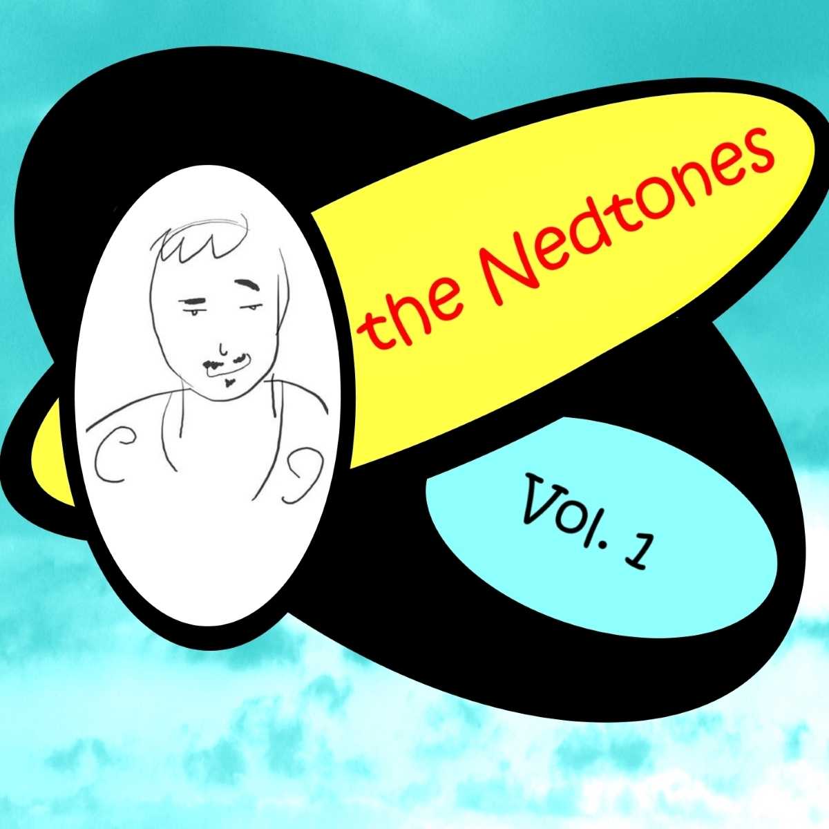
When my songwriter husband, Ned Tennis, began cataloging his songs on CD, he asked me to design the cover. At first I suggested that an actual graphic designer might be hired but the budget prevailed. I took the challenge. And because I’m such an expert with the Internet (read – I know a tiny bit more, and have a lot more patience, than he does,) I also set up his web site (with initial help from my brother, Bob.)
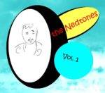
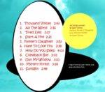
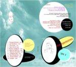
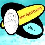
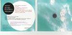
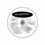
Front, inside, and back of the four panel CD package
Inspiration
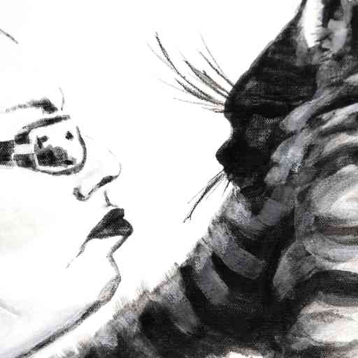
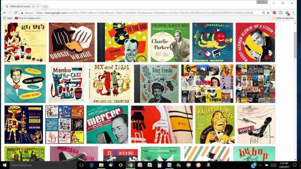
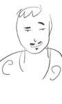
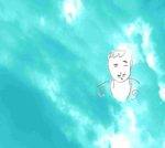
Though Ned’s music is heavily influenced by his love of the Beatles, it was this quick drawing of Ned by our niece that spurred ideas for the cover. Ned and I also did Google searches of pop album covers, quickly gravitating to the 1940’s, and these visuals acted as the design springboard for The Nedtones Vol. 1.
I’m sure other aesthetics also filtered through my subconscious, but the ‘40s covers that initially grabbed us were clean, punchy, and often used cartoons. We ended up using the caricature of Ned, from 2011, by our niece, Sarah Petrulis. (You can see Sarah’s recent work here link to Facebook.)
Development
The first couple of versions used cloud shapes to contain the text. The cloud image came from the lyrics of “Out my Window.”
I decided it was just too cheesy. So instead, I used a photo of clouds as an abstract background and adjusted the color. At one point I darkened the background attempting to give it a more of a sophisticated or somber feel.
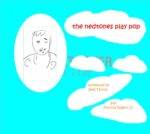

cloud balloons, cloud photo, darkened background
Ned preferred the brighter cyan.
As soon as the design was committed to print I had regrets. I reworked the front for a design that could be used as the official digital distribution cover and for any reprints.
Technical (do your eyes glaze over? Scroll to Conclusion)
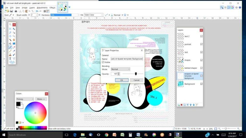
This side job took me away from my paints but developed my proficiency with the open-source digital photo-editing software paint-dot-net.
Yes the whole thing was done on a computer, no old school techniques this time. (wellll, old school is relative isn’t it? Seeing as a lot of people don’t even use hard copies of music anymore…) And really, I should have used a layout program for crisper text, not a photo program. But next time.
The CD printing company provided PDF templates so the package fold/cut/bleed lines and safety margins were already mapped out.
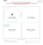
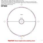
ecopack 4 PANEL CD cover template, disk face template
The software is a lot like Photoshop, with multiple layers on which you can manipulate the opacity/transparency levels and apply style filters, and add images and words with basic drawing, cutting, coloring, and text tools.
Basically, you can tryout and save many variations and combinations with relative ease. Compare the ease of that to the labor of collaging with paper and glue, which I considered doing, and you will understand why I came to my senses.
What I didn’t realize (because I jumped right in, not really catching the significance of the instructions) was that the submitted design, in PDF form, required print colors RGB (red green blue) not screen colors CMYK (cyan, magenta, yellow and black). Experienced graphic designers already know this.
Besides concerns the color would not be right converting to less abundant ink colors, the software had glitches making the color separation for PDF files. Luckily Ned’s recording studio (https://lastdaypro.com/ in Terre Haute) had the proper software.
scan of inside printed cover, compared to colors in the design
Conclusion
I don’t know why I wasn’t interested in studying graphic design as a kid, but I appreciate the efficiency, order, and beauty of applied art now.
My parents were classical musician/educators and maybe that influenced my pursuit of “serious” or pure art. (Nor did I have any inklings, or for that matter-pressure, to pursue a practical side of art.—There’s a whole nother conversation.)
I grew up thinking a lot of art techniques were cheating. (Drawing from photographs, instead of live models, for example, which I do now. (Even during a time when all tradition, and mediums, and concepts about art were continuing to be blown open, but I didn’t know that then.)
And I admit I have been prejudiced and suspicious against art made on a computer. Well, maybe I’m softening my stance a bit. There are some great computer software tools. And it turns out that regardless of my abilities, I do enjoy designing graphics but I still like physical materials and tools you can hold in your hands.
Afterword
This all took place last November/December. Along with the holiday interruptions and the election dramas this design process threw me off my studio practice. It took me too long to get off the computer. I’m too easily sidetracked.
Have you worked on something out of your usual skill set? Or changed your opinion on a mode of operation?
Please share your thoughts below.
If you’re curious about the Nedtones, hop on over to nedtennis.com (a work in progress).
Hi, Lisa,
I’m always very, very glad to hear from you and to find out what you are working on. I’ll check out the Arts Illiana exhibition soon and perhaps see you this Friday evening.
You asked about working on something “outside your usual skill set” and the answer is, “Yes.” Most definitely! I submitted a collage last year for the Swope’s juried exhibition honoring Eugene Debs. It was quite _______. (Well, I don’t know quite what word I should use to describe the experience. You are quite “wordy,” as my mother always said of me. Help!)
Take care, Lisa.
Sherry, I hope you are continuing to collage, I would love to see it. And you are wordy in the best sense, you have put your wordiness to great use. Thanks for sharing your experience.